
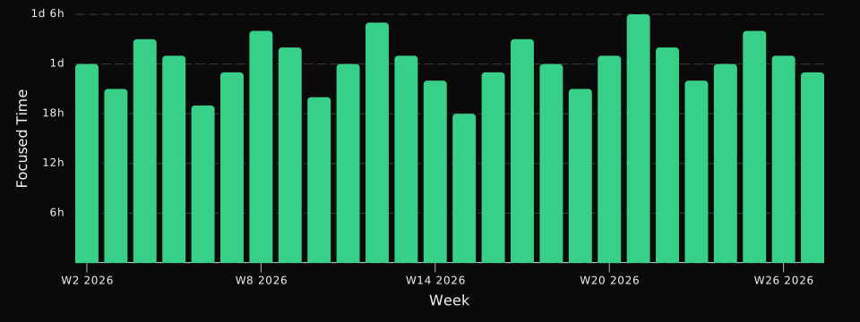
An honest record of where the time went
RescueTime tracks your time at the application and document level, hour by hour, without anyone having to remember to start a timer. That produces a far more accurate picture of a week than memory does.
DayDash brings that record onto a dashboard with everything else you track, so your time data and your health, spending and environment data sit on one timeline.
Questions people explore with this
- What do my focused hours look like alongside how I slept?
- Which times of day show up as my most productive over a month?
- How do meeting-heavy days compare with the rest of the week?
- Has my time distribution shifted since I changed how I work?
A tip on categories
RescueTime lets you tune its categorization to your own definition of productive, and it’s worth doing — the more your categories reflect how you actually work, the more useful the charts get. If a tool matters a lot to you, charting on the specific activity rather than the broad category will usually give you a cleaner signal.