The tracking you already do, on the same timeline as everything else
Most people who track anything about themselves started in a spreadsheet. A weight column, a habit grid, a tab for freelance invoices, a reading log, a run of readings from some device that only exports CSV. Sheets is very good at that: it takes any shape you want, it does the arithmetic, and it’s already open.
DayDash reads that sheet and puts it on a dashboard next to your sleep, your spending and your screen time. The spreadsheet stays exactly where it is and stays the place you type things in — nothing moves, nothing gets migrated, and you keep every formula you wrote.
What people connect
There’s no fixed schema here, because the schema is whatever your sheet already looks like. Some of the things people point DayDash at:
- Hand-kept logs — weight, mood, migraines, practice sessions, cigarettes not smoked, glasses of water.
- Anything with a manual export — a device or service that gives you a download but has no API, dropped into a sheet on a schedule.
- Money you track yourself — invoices, freelance income, a side business’s monthly numbers, subscriptions you’re auditing.
- Shared sheets — a household chore or spending tab, a training log you keep with a coach, a team’s weekly numbers.
- Sheets that are already someone else’s output — a Form’s responses tab, or a sheet some other tool writes into on a schedule.
Each sheet or cell range you pick becomes its own data source section, so one spreadsheet with four tabs can turn into four independent things to chart.
Questions people explore with this
- How does the thing I’ve been tracking by hand line up with my sleep, or my working hours?
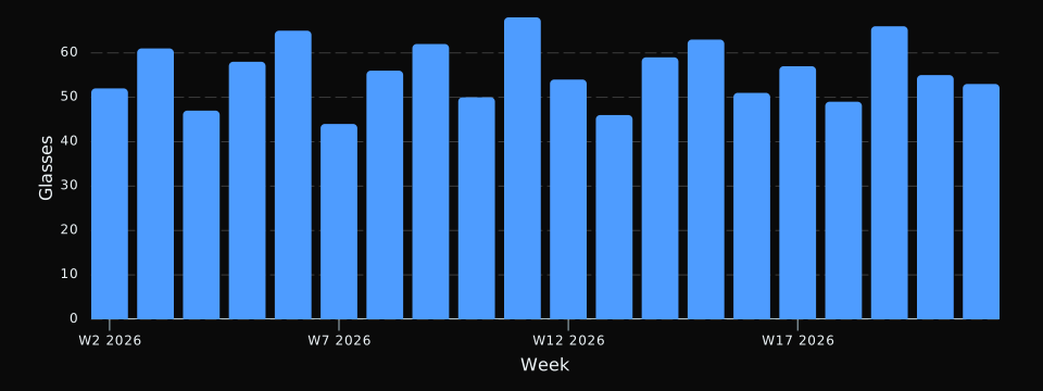
- What does two years of my own logging actually look like as a chart?
- Which months were heaviest for the numbers I track manually?
- Can I put my hand-kept log and my automatic data on one axis and compare them?
How the connection works
You pick a file through Google’s own picker, choose the sheets and cell ranges you want, and DayDash guesses each column’s type and unit from the data — you can correct any of it before you finish, and change labels, types and units later.
Access is scoped with Google’s drive.file permission, which means DayDash can only ever open the specific files you hand it through that picker. It cannot list your Drive, search it, or reach a file you didn’t explicitly choose. Each sync re-reads the range and replaces it, so corrections you make in the sheet show up in your charts rather than sitting alongside the old values.
A note on structure
The tidier the sheet, the less work you’ll do afterwards. One header row, one thing per column, one record per row, and a date column that’s formatted as a date will get you charts immediately. If your sheet is laid out for reading rather than for calculating — merged cells, sub-headers, a summary block halfway down — it’s usually easier to add a plain tab that references the pretty one and point DayDash at that.