A clean ledger deserves good charts
YNAB’s method produces something unusual: a complete, hand-categorized record of where your money actually went, labelled by you as you went along. That is a genuinely high-quality dataset, and it rewards being looked at over long spans.
DayDash pulls your transactions and monthly plan summaries in so you can chart them across months and view them alongside the rest of what you track.
Questions people explore with this
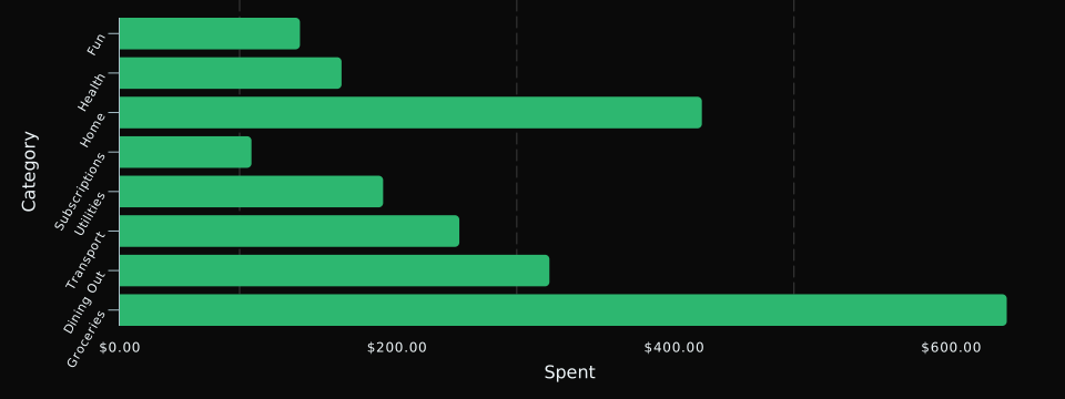
- How do my category totals move across a full year?
- What does my spending look like on the same timeline as my sleep or my working hours?
- Which categories are seasonal, and which are steady?
- How has my savings rate trended over several years?
Read-only, and multi-currency aware
DayDash requests read-only access. It cannot create transactions, move money, or change your plan — the OAuth scope makes that impossible rather than merely unlikely. Monetary fields adopt your plan’s currency automatically, so multi-currency plans chart correctly instead of silently mixing units.